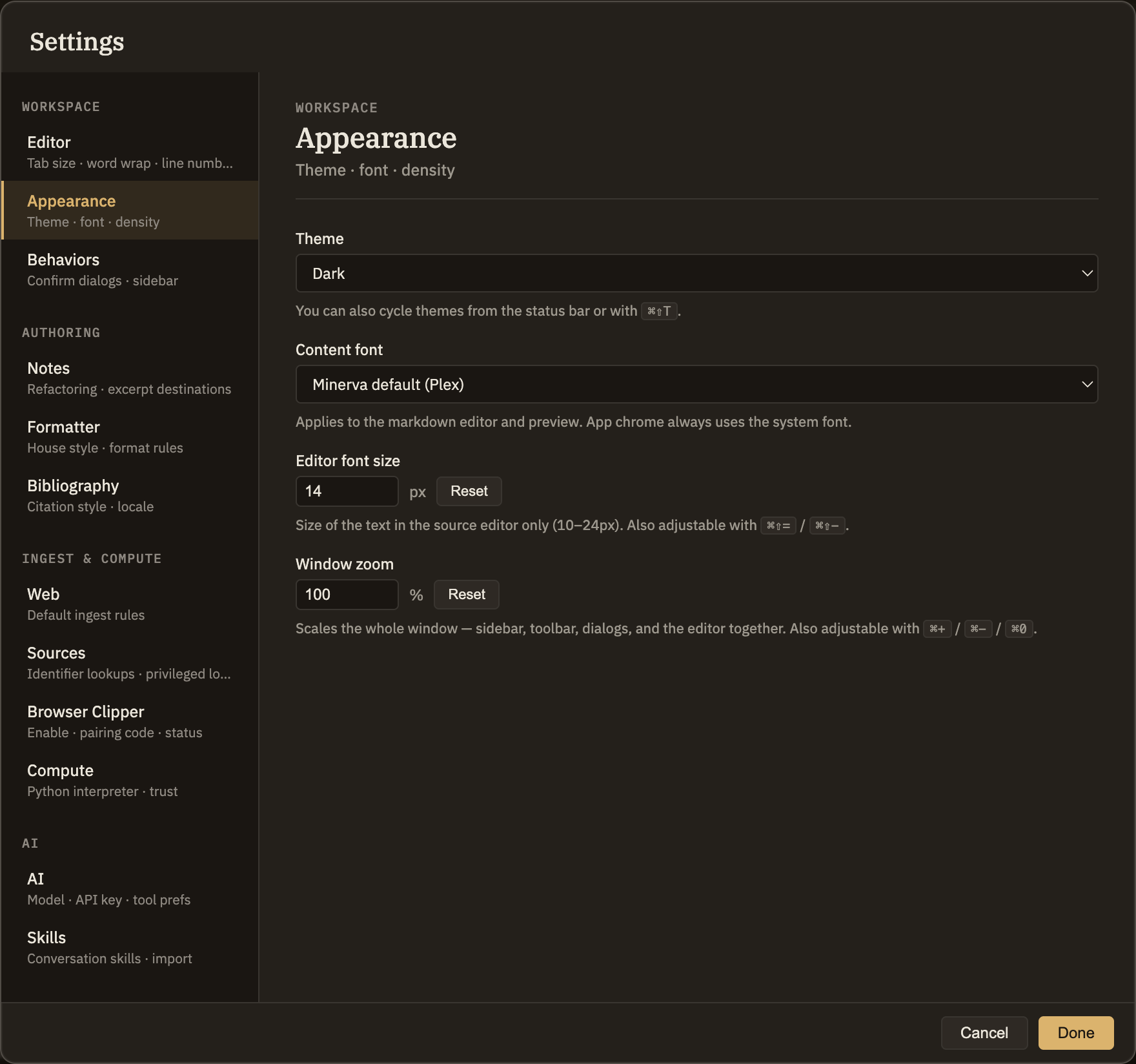
Appearance
This tab holds two choices: the theme the whole app wears, and the font your notes are written and read in. Both take effect the moment you change them.
Theme
The Theme dropdown lets you pick Dark, Light, High Contrast, or System (which follows your computer's own light-or-dark setting). You can also switch themes from the status bar or with ⌘⇧T. For a closer look at each theme, see the Themes page.
Content font
The Content font dropdown sets the typeface your notes appear in, both as you write and in the reading view. It changes only your note text — the app's menus, sidebars, and dialogs keep their usual look. Choose whichever reads best for you:
Minerva default
Minerva's built-in typewriter-style font. The look you start with.
System Sans
A clean, rounded font for a relaxed, prose-first reading feel.
Serif
A book-like serif for long-form notes.
Monospace
An even-width font where every character lines up.
JetBrains Mono
A popular even-width font, used if you have it installed.
Berkeley Mono
Another even-width font, used if you have it installed.
System mono
Your computer's own even-width font.